Friday 27 March 2009

Double Page Spread Final with Commentary


I previously did like my double page spread however changes had to be made to make it look more attractive to the consumer. I changed the colour of the main kicker to a light green to match the glow around Pierre. Then, I added the same layer of text behind the kicker, this time in a black colour, to stand out and give a 3D effect, as if the kicker is coming off the page. Also, I altered the hue of green I had previously chosen for the questions in the interview, to stand out from the black text.
Although the drop cap previously looked effective, I changed the format of the text around the drop cap to wrap around it and for it to look like every other article does with a drop cap.
Around Pierre's cropped out image, I added a distorted shadowed effect to also give a 3D effect.

Lastly, there were a few spelling mistakes and typos which I had to correct, in order for the readers to actually understand and for it to keep up a professional image.


Table Of Contents Final with Commentary


I made major changes to the Table of Contents for many reasons. Firstly, the purple hue on the draft did not work well with the magazine's already formed image from the front cover and did not work well colour wise. Also, the layout was untidy and not easily read which could have confused readers and immediately make them lose interest. I changed the colour of the background to black with the contrasting colour of electric pink, to suit the front cover aswell. Furthermore, I organised the categories of the magazine, for example the Gigs, Posters, Interviews and New Sound, and put each main artist or song and paired it with a page number. The immediate connotations of my Table Of Contents would be pink, being attractive and hot, black being classic and original and white being simple yet bold.

Final Front Cover with Commentary

For the final draft, the only changes I made to the publication was to shorten the barcode by removing the word "Limited" and also make the white outline on the button thicker by making increasing the diameter.

Friday 20 March 2009

Double Page Spread Draft With Commentary


The double page spread is provided with clarity, style, colour and special effects which makes it look easy to read. I have layed it out simply, with Pierre's image on one side and the main text on the other side, so that when it is folded, it does not fold over the text to make it difficult to read. The type of language used within the interview is similar to how artists in the Grime industry communicate and speak with, using words such as "sik" and "holla", making it more believeable for readers to read.

Double Page Spread Mock Up


Double Page Spread Photoshoot Plan


Table of Contents Draft With Commentary


This contents page has a different vibe to the front cover because of its differentiation in colour. I used the Hue and Saturation tool to colorize the canvas into a purple colour to contrast the colours of the magazine. Also, I have chosen a range of fonts from the Comic, Sci Fi, Graffiti and Curly sections on http://www.1001freefonts.com/ to embellish the contents page with something different. Also, I wanted the contents page to be clear and organised, with a neat eye flow so that it is not confusing for the reader to find the page. I have included the masthead again, just to continue the advertising of the name.

Table Of Contents Photoshoot Plan and Mockup


Front Cover Draft With Commentary and Mood Board


For my front cover, I chose Pierre as my model, for many reasons. Firstly, he studies Drama and Music Technology at AS level, so is familiar with the codes and conventions of the music world. Also, because he is a fan of Grime music, it fits in the set criteria for my magazine Fast Forward.


I chose a medium shot angle, with Pierre's head slightly tilted so that it gives off the laid-back and relaxed look that I want Pierre to have.
I chose to airbrush the background black, to focus all the attention on the artist/model. Also, I have chosen an LCD font called "Digital Dream" for my masthead, to emphasise the title's meaning and the way it is always seen on the stereo.


I have included a specific type of mode of address for my target audience, boys and girls aged 16-29, using kickers such as " Win Kid Cudi Tickets" which is inclusive to all Grime music fans.


Moodboard

Front Cover Photo Shoot Plan, Mock Up, Masthead Research


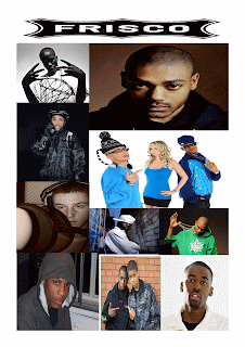
My masthead research was quick and easy due to the number of people that wanted the famous and well known DS-Digital font that stereos and radios use to indicate the sign "Fast Forward". The LCD theme was popular amongst the young people opposed to Fashion Victim, which probably would have not suited the style of this magazine.